
Close stacked modals intelligently via ESC hotkey in Vue.js
Modals in modern web applications
Modals have spurred controversy since the beginning of time. They are a bit of an escape hatch but if used in the correct manner, it allows a focused experience on one form/UI, hiding the background, but not completely, so the user can get things done quickly and get back to where they were, without a full page change. A great modal experience fits right in, and does not leave a bad taste in the mouth for the user.
Stacked Modals
A single modal can be problematic, now how about more than one, opened on top of each other? Sounds tricky and maybe not the best experience, but if you happen to run into this, you'll need to make sure the Escape key doesn't close both at the same time!
Modals in Laravel Jetstream for Vue.js
In the default install for Laravel Jetstream (Vue flavor), there is a Modal.vue component (link), which the following code to close the modal on escape key:
1<script setup lang="ts"> 2const emit = defineEmits(['close']); 3 4watch(() => props.show, () => { 5 if (props.show) { 6 document.body.style.overflow = 'hidden'; 7 } else { 8 document.body.style.overflow = null; 9 }10});11 12const close = () => {13 if (props.closeable) {14 emit('close');15 }16};17 18const closeOnEscape = (e) => {19 if (e.key === 'Escape' && props.show) {20 close();21 }22};23 24onMounted(() => document.addEventListener('keydown', closeOnEscape));25 26onUnmounted(() => {27 document.removeEventListener('keydown', closeOnEscape);28 document.body.style.overflow = null;29});Default hotkey escape behavior
This works fantastically for one modal, however if you keep this code as is, and open up two modals, you'll notice both of these event listeners will fire, and both modals will close. Uh oh! Let's fix!
What does stacked modals look like in code?
Simply put, using multiple Modal.vue components in your codebase (using the ex from Laravel Jetstream):
1<script setup lang="ts"> 2const showFirstModal = ref(true); 3const showSecondModal = ref(true); 4</script> 5 6<template> 7 <DialogModal :show="showFirstModal" @close="closeFirstModal"> 8 </DialogModal> 9 10 <DialogModal :show="showSecondModal" @close="closeSecondModal">11 </DialogModal>12</template>This will have two modal components that are currently shown, now you can press the Esc key and see both of these close, even though one should be on top of another.
If it looks off visually, it might be a related problem with stacked modals: z-index for Modals. By default the
Modal.vuecomponent usesz-50but stacked Modals should have a higher z-index for each one that is opened on top!
Implementing smart esc hotkey for stacked modals
To know which modal component to close, if we have multiple shown, we'll have to register global state when each modal is shown. You can roll your own global state pattern, but I really love Pinia the recommend Store library for Vue.js 3!
Modal global state: store
Create file: modals.ts:
1interface ModalStoreState { 2 modalCount: number; 3 modalIds: number[]; 4 allowClose: boolean; 5} 6 7export const useModalStore = defineStore('modals', { 8 state: (): ModalStoreState => { 9 return {10 modalCount: 0,11 modalIds: [],12 allowClose: true,13 };14 },15});This store encapsulates a few pieces of state:
-
Modal count: how many modals are shown currently -
Modal ids: a stack of identifiers for modals that are shown -
Allow close: allows us to temporarily turn off the ability to close modals, explained later
Modifying Modal.vue to use this modals store
We need to modify our modals store when the modal is shown. We can use a watcher for that, to detect if it's being shown or being hidden, and register/unregister the modal in the store:
Modal.vue:
1<script setup lang="ts"> 2import { useModalStore } from '@/Stores/modals'; 3 4const modalStore = useModalStore(); 5const modalId = ref<number | null>(null); 6 7watch( 8 () => props.show, 9 () => {10 if (props.show) {11 document.body.style.overflow = 'hidden';12 13 modalId.value = modalStore.modalCount + 1;14 15 modalStore.modalCount += 1;16 modalStore.modalIds.push(modalId.value);17 } else {18 document.body.style.overflow = '';19 20 modalStore.modalCount -= 1;21 22 if (modalId.value) {23 modalStore.modalIds.splice(modalStore.modalIds.indexOf(modalId.value), 1);24 }25 }26 },27);State transitions
This will:
- Create a
modalIdfor this modal instance, when shown, and add it to visiblemodalIds - Add one to the
modalCount, when shown - Remove one from the
modalCount, when hidden - Remove the
modalIdregistered for this modal instance, when hidden
This is great, we also need to modify the event listener for closeOnEscape!
Intelligent closing topmost Modal on escape
Modify Modal.vue to add:
1const closeOnEscape = (e: KeyboardEvent) => { 2 if ( 3 props.show && 4 e.key === 'Escape' && 5 modalStore.allowClose && 6 modalId.value === modalStore.modalIds[modalStore.modalIds.length - 1] 7 ) { 8 modalStore.allowClose = false; 9 10 // After modal animation close finishes, allow more modals to close11 setTimeout(() => {12 modalStore.allowClose = true;13 }, 250);14 15 close();16 }17};To know if we should close the current modal, we should:
- Check if it's shown
- Check if we can close any modals (store state)
- Check if the current modal is topmost (store state)
If so, close the modal, but before we do that, ensure no other modals close with it (since all visible/shown modals will receive this keyboard event for escape). Then after the close animation, enable other modals to close.
Setting up the z-index for Modals
This one is a bit more straightforward, we need to simply increment the z-index as we create more modals that lie on top of one another!
Modify Modal.vue:
1<script setup lang="ts"> 2const zIndexStyle = computed(() => { 3 if (modalId.value) { 4 return { 5 zIndex: 50 + modalId.value, 6 }; 7 } else { 8 return { 9 zIndex: 50,10 };11 }12});13</script>14 15<template>16 <teleport to="body">17 <transition leave-active-class="duration-200">18 <div19 v-show="show"20 class="fixed inset-0 overflow-y-auto px-4 py-6 sm:px-0"21 :style="zIndexStyle"22 scroll-region23 >24 ....The zIndexStyle was added to the div for the Modal component! The modalId is used as a counter to influence the z-index attribute.
I didn't use Tailwind
z-indexclasses since it would be something like:z-$varwhere Tailwind would not be able to scan our source files to find thatz-$dynamicValueHereis used, so fall back to simple ol CSS!
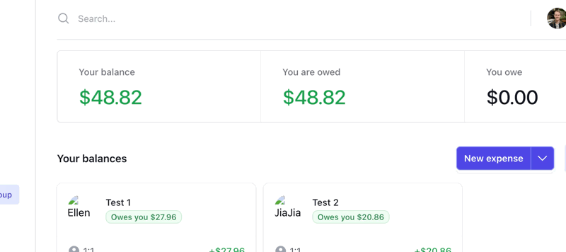
What this looks like in production
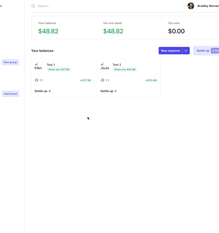
Used in production at: SplitMyExpenses
When I press escape, only the topmost modal closes, then I press escape again, and the modal previously under it, closes!
Wrapping up
Now you have a intelligent Modal that registers itself with your global app state, to ensure:
- Only the topmost
Modalinstance shown closes on escape - The layering of
Modalinstances is correct w.r.t.z-index
This is a super simple data store, you can build off this and allow other components to close Modals if you want, especially if you are deeply nesting these modals. I've found Pinia to be fantastic, fast, and easy to get up and running quickly. Enables so much awesome control from anywhere in your app, but also be careful, it can be an anti-pattern if used incorrectly!