
Writing my first Apple Watch app in SwiftUI: Covid Aware
Ever since SwiftUI came out, I’ve been itching to get my hands on it in any manner possible. I wanted to create an app with the new iteration of SwiftUI from WWDC 2020, which required watchOS 7.0+, iOS 14.0+, macOS 11.0+. The new SwiftUI release delivered plenty of bug fixes from the initial version and an array of new and exciting features to power modern applications.
My ultimate motivation to build is to learn, so I wanted to leverage the latest Apple ecosystem of SwiftUI + Combine. On top of that, I recently purchased my first Apple Watch, so I also wanted to evaluate the developer experience for creating apps on the Apple Watch. After one month, I created an open-source standalone watchOS 7 application for COVID-19 statistics called Covid Aware.
 Covid Aware — App walkthrough
 Covid Aware — GitHub README
Why a COVID-19 daily statistics application?
COVID statistics are being broadcast day-in and day-out across TV, social media, and on the radio. People are routinely checking COVID stats in their local state to understand the current climate in their area. I researched a few free APIs to power the dataset for COVID and decided to use The COVID Tracking Project. I was impressed with their dataset being accurate, regularly updated, and, surprisingly, accompanied by great developer documentation. My goal was to create a watch app that would be timely, useful, and applicable to nearly everyone in the world (who has an Apple Watch). So how do I design a user interface for a watch app?
![]() The COVID Tracking Project — About the Data
The COVID Tracking Project — About the Data
Designing a great experience on the Apple Watch
The watch is a different landscape for user interfaces. I’m accustomed to leveraging a larger screen size in both vertical and horizontal spaces, either on mobile (iOS, iPad) or desktop (web). The watch has unique constraints since it is relatively tiny, requires a “glanceable” interface, and has interaction restrictions, such as large buttons to ensure a large enough tap target on small screen sizes.
As I began thinking about the initial screens for my app, I needed to know more about how Apple Watch apps currently operate today. I read Apple’s Human Interface Guidelines for Apple Watch. I would recommend all developers in the Apple ecosystem to review the HIG for their platform(s) as Apple goes into great detail on high-level topics and also dives deep into nuanced topics on how to best leverage, display, and design content on a specific platform. HIG includes interactions, animations, and UI elements. I also like to take a detailed look at Apple’s native watchOS applications and go through each one to note all the interactions and common UI patterns, to make my app “fit in”.
 Apple — Human Interface Guidelines: Apple Watch
Initial screen: design and implementation
I started coding the initial screen of the app, which included statistics for the United States for various metrics: hospitalization, total cases, deaths. I followed best practices with HIG and Apple’s apps as an example. It wasn’t too hard to get a basic list showing metrics powered by the COVID API, but as I got farther along, I realized the app needed something more.
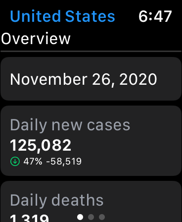 Covid Aware — US: Overview stats
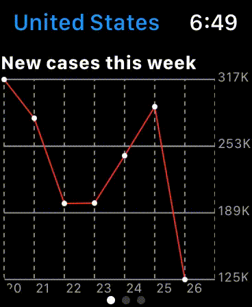
Custom charts on the Apple Watch
I was inspired by the COVID dataset I used. Their website showed various charts to illustrate how metrics changed over time; for example the count of positive COVID cases over the past week in the United States. SwiftUI makes creating tiny reusable UI components easy, so I thought:
How hard could it be to create a chart view that was composed of the individual core chart components?
The SwiftUI code would probably look very similar to the code I would write in SwiftUI for iPhone or iPad.
So I dove in and designed my chart system which covered the usual chart library offerings:
Axises
Axis labels
Chart grid lines
Scaling/sizing
Making a chart is difficult to do well outright, but showing that same chart in a usable and useful manner on a screen size around 300–500 pixels (depending on watch model and size) is extremely challenging. A chart needs to handle interactions for it to be considered great. I wanted charts to be the feature in my app that achieves the “wow factor”.
Therefore, I added in the ability to scroll the charts, so that the chart doesn’t need to be squished into a, for example, 400-pixel square watch screen, but could take up any horizontal size, and the user could scroll to see the full view. Since it’s an Apple Watch, we can leverage the usual native scrolling element: the crown. Users can pan with their finger on the watch screen to scroll the chart or physically scroll the crown to pan the chart left and right quickly.
 Covid Aware — US: Weekly chart
Chart constraints in SwiftUI
To draw the chart and allow for scrolling, the chart was embedded in a scroll view. The chart is composed of a single ZStack that includes all of the individual graph components layered on top of each other:
Vertical chart grid lines
Horizontal chart grid lines
X-Axis labels
Chart line
Current X-Axis line: 1px width line to show the current X-axis point. Shows the x and y value (metric value and date)
Circles around each point if using a small scale chart (applicable for a weekly chart, but not an all-time chart)
The stack of items is rendered offscreen using the Metal API (SwiftUI drawingGroup) to get fantastic performance using dedicated graphics. The chart was scrollable now, but I wanted to also be able to move to an arbitrary point on the chart depending on the date the user was viewing. Unfortunately, my current behavior of using a scroll view that scrolled a large single chart view did not work.
SwiftUI scroll views do not allow for scrolling to an arbitrary point offset. In my case, I was using a horizontal scroll view so I was trying to scroll my scroll view to say 40 pixels, but unfortunately, it currently isn’t possible in SwiftUI. Some of these limitations are for good reasons, however, I’m not sure the reasoning behind not allowing this in the current release. The SwiftUI solution to this problem is to scroll to specific views within the scroll view, however, I only had one flattened view that comprised of the full chart, so that didn’t work for me.
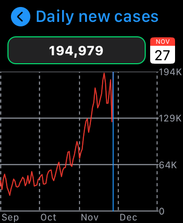 Covid Aware — US: Daily new cases chart
The right behavior with a different approach
I changed my code back and forth: inserted invisible views at a specific offset to try to get my scroll view to jump to that view and therefore that scroll offset. I tried using a custom scroll view that I found from a Google search that would allow reading the scroll view offset, but I couldn’t set the offset, only read it.
Well, what about not scrolling the scroll view, but applying an X offset to the underlying chart view which would emulate a scroll? It turned out to work wonderfully, much better than I had hoped! The GIF below shows the X offset of the chart as the user scrolls the crown. To the user, it seemed the scroll was moving the white box (scroll view) but it was moving the red box (chart view) left and right.
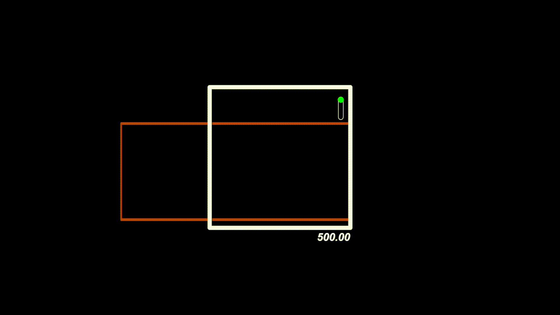 Scroll animation. The chart is the red box. The scroll view is the white box. On scroll, the chart view is offset to emulate the correct scrolling behavior a user would expect.
We start at the max offset (width of the chart that is offscreen) and then as the user scrolls we lower the offset to zero, which shows the start of the chart at the very left of the screen. The chart displays data in a time linear fashion, showing the earliest date at the leftmost point and the most recent date at the rightmost point. The chart is auto-scrolled to the very right so that the most recent date is shown.
It felt just right at this point, supporting scrolling, interactions, and natural feeling charts on the Apple Watch. Fortunately, I didn’t need to pull in a 3rd party dependency, it was all accomplished within the constraints of SwiftUI and watchOS 7. It isn’t rocket science, but I’m proud of the outcome: the culmination of fine-tuning the chart subtitles led to a great, intuitive user experience.
 Covid Aware — Scrollable charts
Updating the COVID dataset automatically each day
While the charts are core to creating a great functioning app, there are lots of features from the Apple Watch that can push a great app to be even better. Apple’s watchOS 7 allows for apps to request a time from the operating system to send a background network request to fetch new data to keep the interface up-to-date. Since the COVID dataset updates its data roughly every day at 7:00 PM eastern time, the app should fetch the latest changes a short period after that time, to ensure the user is looking at the latest data.
The app asks the OS to schedule itself around 7 PM EST converted to their local timezone, to fetch the latest data for all screens that are active. Once the data fetch is complete, the app prompts a local notification to the user that the app’s COVID data has been updated. A small but powerful feature to keep users up-to-date with zero effort on their end.
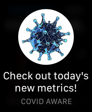 Covid Aware — Data updated notification
SwiftUI on Apple Watch, Xcode, watchOS
Over the month I worked on the side project, I enjoyed most parts of working in SwiftUI, however, some rough edges can make seemingly simple tasks in UIKit/AppKit much harder in the SwiftUI paradigm. Working in SwiftUI is a multi-layer shift in thinking from the traditional Apple programming approach. The UI layer has different assumptions and requirements; SwiftUI promotes tiny, composable, reusable UI components. The data layer needs to be thought out very carefully: who owns what, what should update when changing a value, how do I listen for various changes?
Developing a standalone watchOS 7 app in Xcode was also painful at times. Running the simulator for the watch worked out fine 99% of the time, but when testing for production, building to my own Apple Watch had a low success rate. Nearly half of the time, building to my physical device failed to install the app to my watch after the build was complete. I was required to do a seemingly random dance by disconnecting my phone from my computer, restarting Xcode, and opening Devices and Simulators window to achieve a successful install. Additionally, testing the auto-update feature required a physical device, so it was cumbersome to test scheduling my auto-update task to be started in two minutes, then waiting two minutes until the desired time arrived, and then testing to see if my code worked in a real-world environment with OS scheduling.
Overall I would recommend working on a watch app for anyone interested, there is a unique set of challenges and constraints that make it fun and novel in many ways. There are not many apps on the watch App Store and now that SwiftUI is here and production-ready (maybe?), it is much easier to translate an idea to an actual functioning watch application.
Covid Aware
Check it out on GitHub: https://github.com/bradleybernard/CovidAware